New Portrait – Michael Sheen
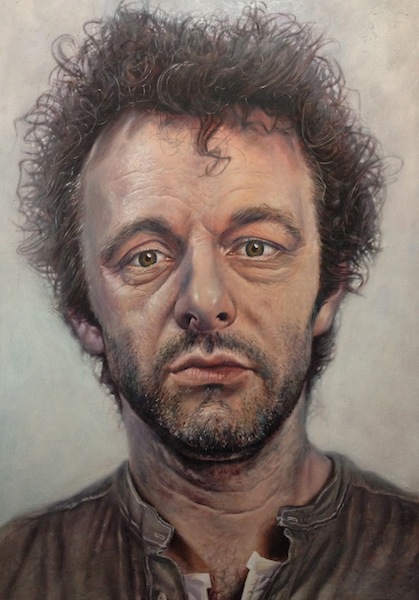
‘Michael Sheen’ – acrylic on canvas 2011
I have known Michael for a little while, and recently went to see his Hamlet, directed by Ian Rickson and currently running at the New Vic. It’s phenomenal. Afterwards we had dinner and Michael spoke at length about what he and Ian had done with the play and why. A couple of weeks later we met again, I cooked an appalling piece of chicken and we asked him about his Passion, a mammoth modern unfurling of the Christ story spread across the streets and beaches of Port Talbot (an industrial port and market town where he grew up, and which has also produced Rob Brydon, Anthony Hopkins and Richard Burton). Michael is deeply energised about his work, and if the formula for success is TALENT + ENERGY (as noted by my manager, who added wisely that the formula for stardom is SUCCESS + ATTITUDE) then Michael radiates them powerfully. He’s surely one of the most extraordinary actors of our generation, and possesses a phenomenal creative drive without any of the exhausting ego that normally accompanies mere dull ambition.
So, as I tend to paint people that I know and find extraordinary, I asked if he would mind awfully. A bit over a week later, interrupted by Christmas of course, and tweeted in its various stages, the large (it’s five foot high) portrait above was completed. For those who do not tweet, or for those who do but who might like to see the sequence together, and above all for those who give a jot because they paint and are interested in the process, I shall set it out as best as I can. Here then, is how it came together:
I prefer to work from photographs, so wherever possible I take my own. I can create a makeshift photographic studio in my painting room, so I took a bunch of Michael to work from. Ultimately I decide on one, tweak it in Lightroom to look its best, and print it out large (I have an A2 printer which does the job very well). He’s looking rather shaggy at the moment because of the role which he undertakes every night (a far cry from his shiny Tony Blair), which I knew would make the picture more interesting.
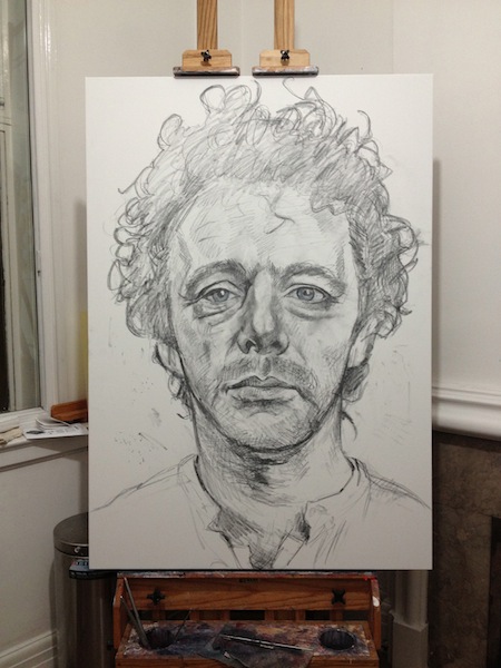
I then began the portrait by sketching directly onto the canvas:
Next, I block in some colour to set a unifying tone for the picture. Orange is a good one for flesh, but it can be anything, depending on the palette that the photograph suggests. The idea is then to let this blocked colour peep through as the layers of colour are built up. You want to make sure that every inch of the picture is interesting. With a good painting, you can generally make a little tube with your hand and look through it at tiny, isolated areas of canvas and they will all be of interest. There’ll always be stuff going on. The way to do this is by building up layers of colour. So we begin with orange:
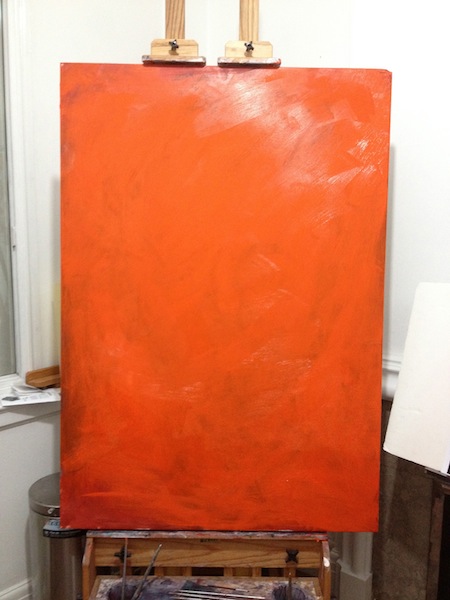
And just enough of the sketch is left showing through to work with as a guide. Black paint does the job better than pencil, but I’ve kind of gotten used to using pencil. But use black paint to sketch if you’re using this method (and obviously white to erase).
Then next I get the shape of the features in, and the areas of light and dark. This is about sculpting the face and also getting down some basic colour – all things which will keep showing through as I add layers. For this reason I paint thinly, or rather with a fairly dry brush. I don’t want to lose what’s behind the colour I’m adding. Later on I’ll use glazes (a small dash of colour with a larger amount of a transparent glazing medium) to the same effect – but for now, thin layers that keep the orange showing:
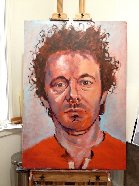
And I’ve started to get some colour into the background too. The orange will provide some unity – you want to make sure that the colours you’re using for the subject are also in the background, so the two relate to each other. Otherwise you can sometimes have a figure that fights uncomfortably with what’s behind it. The left side of the face (our left as we look at it) has a purply tone, whereas the right side is warmer, so I’ve started to get those colours in too.
The process is now largely one of alternating between detail and sculpting (and using fairly strong colours and contrasts to do so) and then pulling everything back by going over it all with some fleshy tones (pulled out from what I’m already using) that soften and unify. I also get some colour on the shirt, as I want to include the same colours in all areas. Again, because I’m working with fairly thin paint, it’s easy to do this: it’s best to use as few colours as possible on your palette and create others from mixing them: that way you keep a sense of overall unity, which is one of the qualities that will make it feel ‘real’. The purple, for example, that is appearing in his forehead will come to be used on the face, the shirt and the background.
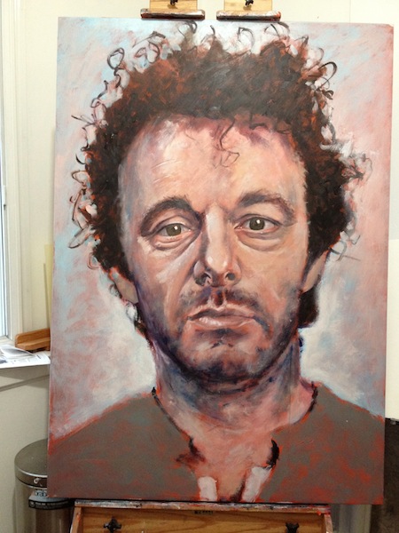
Next I added some detail around the eyes and threw in a bloody background. I often add the premature detail at this point to trick the eye into thinking it’s more complete than it is, and to give me more of a sense of where it is headed. The background was an idea I wanted to try, but I would eventually lose it. At the moment it works OK:
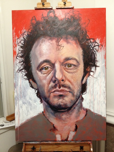
but I realised that I wanted to create some depth with the image, so the background would have to be less sharp and more muted. So with some glaze and a bit of white I brought the background back a bit and worked on the hair detail to put some distance between the two. I’m also continuing to add detail, and areas of colour, and then bring it all back with some unifying colour brushed over the top. That means that I can have, say, the purple in the right side of the nose, but still make it sit with the yellowy creaminess of that side by then brushing or glazing over with a flesh tone. The hair is quite fun to do.
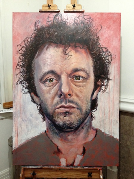
It now has some definition.
Next, I start the shirt. By this point the purple has become very useful (and I could have used that rather than the orange to cover the canvas), so I’m sure to include it in the shirt. I’ve been mixing the purple with a burnt umber to get the darkest/black shade (you don’t want to use flat black, it is lifeless and just looks like a hole in the painting) and some grey mixed in. The result is the basis of a grey shirt, but it still occupies the same tonal world as everything else. I also work more on the hair and am continuing to work on detail. I also soften the nose to make sure that it feels like it’s sticking out of the canvas: it would be slightly out of focus (the photo is all rather sharp so I’m exaggerating the depth a little as I paint) so by softening it, it will lift itself from the face.
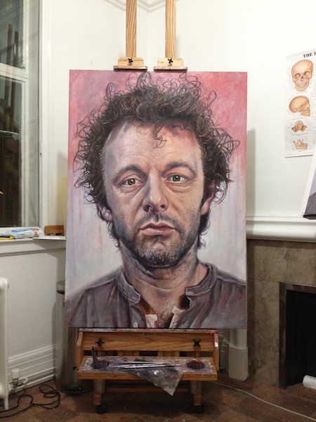
At this point, something is bothering me. It’s looking like an illustration rather than a painting. There’s something ‘drawn’ about it. This may be the hair, as whatever frames the face will provide a context for it, and as the hair looks rather cartoony, it’s making the whole thing feel less like a proper portrait. There’s something else too – the background isn’t helping. It’s too… distracting, making it all seem like a comic-book graphic rather than a portrait. So I decide to lose the background. I first get some colour blocked onto it…
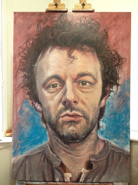
And then white thinly over to move towards a light background (but one that will incorporate and reflect the colours of the face for the sake of unity). I’ve also lost the edges of the hair, which will mean I can re-do them with a softness that will help lose the cartoonish quality I don’t want. So now we have this:
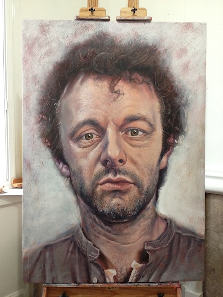
And with the hair added, I’m happier. I’m painting ‘background’ and ‘foreground’ hair to get depth. The hair at the back is soft and purply, which blends it into the background a little, and then I pick out some individual, light-catching strands in the front.
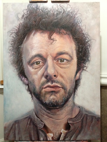
The remaining process is principally now one of softening the background. I use a big brush and a lot of glaze. Here’s me working on a bit of hair detail at this point so you can get a sense of the scale.
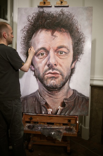
Finally, I put a bit more work into the shirt (it was tempting to leave it in an unfinished state to draw more attention to the face) and soften the focus a little where necessary (by losing edges and working the background a little into the parts I want to soften). And there we are. It took about a week, but that’s a few hours here and there and stopping for Christmas… difficult to qualify exactly how many hours of painting time were involved, and it’s invaluable to leave a painting standing around and come back to it.

I hope you like it. To answer a few questions about it which came up on Twitter: no, I haven’t had any training; I use Liquitex Professional Acrylics (Heavy Body); and no, this isn’t for Michael, although I’ll do him a nice print if he wants one. Yes, I exhibit: The Rebecca Hossack Gallery in Charlotte St, London, looks after my work. Any time I have an exhibition, I publicise it here on the blog and on Twitter. As I generally get fairly little time to paint, it’s normally only one small exhibition a year. But I’ll always let you know. A recent post shows a couple of other portraits, and there are some older ones on the main site. There is also a book available of the caricatures I used to paint.
Michael’s coming over soon to view it – I’ll post a picture of him with it when he does.
There you are. Hope you’re all having lovely ones.
db x


Thank you for sharing how you come to create such wonderfully detailed and professional looking portraits. I’m no painter but I found this blog article really accessible and fascinating to read. The end result is incredible. It’s hard to believe that it took you less than a week and that you’ve never been trained before!
Truly inspirational :0) X
I like how the red that is fighting against the face gradually disappears. again an inspiration! Love your portrait of Dawkins
Wonderful !! it is really amazing and much more fantastic than i have ever expected.
Keep up the Good work !!
Wonderful work Derren, you never cease to amaze me with your skill as an Artist. Michael will be very pleased I’m sure. Have a splendid New Year and Best wishes, Doc.
Amazing – what a masterpiece!
Hi
Darren. I have read, with total fascination, how you have built up the
picture of Michael. Absorbing; technical; creative. I have nothing other
than total admiration for both your thinking process and execution of
this portrait which provides an insight into the character of Michael as
Hamlet, yet also the personna of the man.
Regretably, words are insufficient to correctly and purposefully
describe that which is presented here!
Brilliant! Derren your art work is coming together now, I love the detail of the eyes and hair.Well done matey! I would love to see your art work when you next exhibit,please let us know when that will be.And a Happy New year to you and everyone on this Blog.xx
Another fantastic portrait! Michael Sheen looks very contemplative there. A good portrait reveals the personality of the subject, which this one certainly does.
Best wishes for the New Year, Derren!. Hope 2012 is good for you.
Amazing portrait Derren and watching how each stage of the process comes together is incredible, just wish I had the ability to create something so beautiful. Hope you had a lovely Christmas and I wish you and your loved ones a very happy new year. x
So who’s the guy painting? Really doesn’t look like you! Did someone shave your head during the festivities?
When you give up your day job, will living in the countryside with several cats and many canvases be the way ahead?
Absolutely amazing. It’s a shame you don’t live on Venus, as 1 Venus day is 243 Earth days, thus, you could have more time to paint and we’d have more of a portfolio to look at.
Love this! I do wonder, though, what the problem is with leaving it looking like an illustration. I quite like how it looked at that stage (with the hair and the red background). Do you only like creating proper Portraits?
i like it 🙂
Nice to see some of your art here -especially progressions.
Hi Derren,
Great Technique. You would probably make a great photographer if you picked up a camera and learnt photoshop. Your understanding of colour, depth and sense of reality give you real style. But hey – you’re already a great performer. Have a good one as well.
Paul
You are amazing… This is amazing…..
Holy crap. I didn’t know you could paint too, and man can you paint! Amazing.
The odd thing is, they appear more real than the real. Is that because were they real, one would not feel entitled to inspect them so intimately?
Just….amazing. Thank you so much for sharing x
Is there nowt you can’t do…?
😉
A very beautiful painting and such incredible detail but I have a challenge for you: when I studied art our teacher asked us not to work from photographs but to paint directly on to canvas from a live model. This way we had to learn to read the light and the way it fell ourself – I wasn’t a fan of this at first but came to see how much it improved our eye. Can’t wait to see more of your work 🙂
First time seeing you work and it is brilliant! I love this portrait and how you show us all the stages of painting it. The sitter will be so pleased with the result!
Mr. Brown,
I- I- How? How can anyone be this good? Well, obviously you can, but us ordinary people with no noted or found talent, excluding the act of living, are jealous. Just saying.
May be able to go to your show in the Waterfront, Belfast, during the dates 25-28 March. The task at the moment is persuading my mother to buy the tickets for me, which may be hard as she isn’t a fan of anything except Elvis, nor does she understand any of my obsessions.
Yours,
Beth. x
I didn’t know you could paint. This is just beautiful.
When I see you on TV now I really don’t think I’ll be so quick to turn over 🙂
Any exhibitions on the go ?
this is beautiful Mr. Brown. Amazed by you multi talent. 😀
Wow, I think having a portrait done by Derren may just have to be a new goal of mine.
Let’s see how we go.
Absolutely fantastic! I just dont get how anyone can paint so well, a fantastic tallent indeed
I went to see Svengali in High Wycombe the other week where Derren did an amazing painting of Johnny Depp. I would like to know if this will go on sale as it was amazing??!!
My word Derren! I never knew you could paint and fabulously might I add! The portrait you have painted of Martin Sheen is magnificent, I love it. You really are a genius. Thank you so much for showing the different stages too. I can’t wait to go and see your new show.
Oops! I did mean Micheal Sheen! Showing my age by automatically typing in Martin. Sorry about that! 🙂